project:
Casa Marrazzo - identità e packaging
[:it]Casa Marrazzo è una grande famiglia di conservieri. Azienda antica e dinamica allo stesso tempo, da tre generazioni custodisce i valori autentici della conservazione artigianale delle specialità del territorio. Un progetto nato nel cuore dell'Agro nocerino sarnese negli anni ‘70 ma che affonda le radici nei primi anni del ‘900. A noi ha chiesto il rinnovamento del marchio e un nuovo packaging per la linea tradizionali, composta da conserve confezionate in latta, e per la linea dei prodotti provenienti da agricoltura biologica. Così siamo partiti dalle origini...
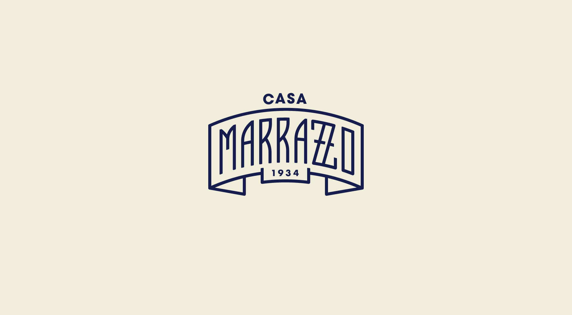
Per il nuovo marchio di Casa Marrazzo ci siamo lasciati ispirare dai loghi utilizzati dalle industrie agroalimentari negli anni ‘50 e lo abbiamo trasposto in chiave moderna.
Un lettering disegnato appositamente per il cliente apposto sull’immagine di un nastro, il blu a fare da sfondo.
Per la linea tradizionali, le diverse tipologie di prodotto sono disegnate con colori vivaci e figure di ortaggi che sembrano saltare fuori dall’etichetta in un gioco di chiaroscuri.
Abbiamo dato nuovo valore ad un prodotto in particolare: il pomodoro pelato napoli, realizzando un'etichetta che si ispira alla grafica delle vecchie confezioni che ritraevano le contadine con i cesti di pomodoro tra le braccia, utilizzate di frequente dai conservieri dell'epoca.
Per la linea bio, invece, abbiamo voluto rappresentare la naturalità e la semplicità dei prodotti con disegni al tratto che, facendo a meno del colore, lasciano spazio al bianco e nero.
Per sentire con gli occhi i sapori di un tempo, in un viaggio tra passato e futuro.
[:en]Casa Marrazzo is a family and a dynamic company at the same time.
They preserved the authentic values of the artisan conservation of local specialities from three generations.
A project born in the heart of the Agro Nocerino Sarnese in the 70s with its roots in the early 1900s.
They asked us the restyling of the brand and new packaging design for the traditional line, made up of canned goods, and for the line of products from organic farming.
So we started from the origins ...
For the new brand of Casa Marrazzo we were inspired by the logos used by the food industry in the 1950s and we transposed it into a modern look. The lettering is tailor-made for the client and is affixed to the image of a ribbon, blue to serve as a backdrop.
For the traditional line, the different types of products are designed with bright colours and vegetable figures that seem to jump out of the label in a game of contrasts.
For the organic line, on the other hand, we wanted to represent the naturalness and simplicity of the raw materials with line drawings that, give space for black and white.
To feel the flavours of the past with your eyes, in a journey between past and future.[:]
client:
Casa Marrazzo
type of work:
Casa Marrazzo - identity and packaging
sector:
food
when?
2018
sound


share:
similar projects: