project:
Wines, fruits and cities
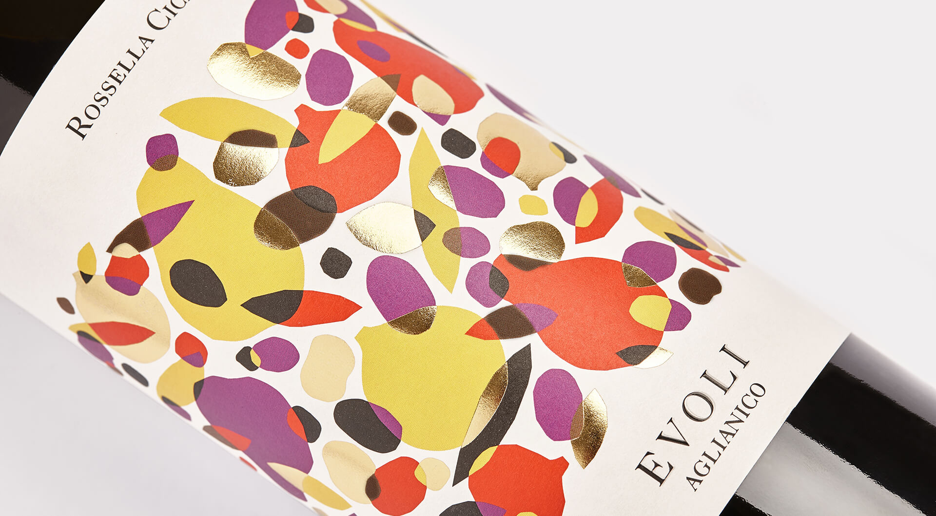
[:it]L’Azienda agricola Rossella Cicalese raccoglie, ancora a mano, le uve nelle vigne di proprietà tra Eboli e Perdifumo, in provincia di Salerno. Da quelle uve ricava Fluminé, Evoli e Jévule: un Fiano dop Cilento il primo, un Aglianico Igp Campania il secondo e un Aglianico Igp riserva il terzo. Nomi che evocano le origini di un territorio dove il sole e il mare sono protagonisti tutto l’anno. Noi abbiamo disegnato le etichette di questa linea di vini dai sentori fruttati, con sfumature di spezie e note balsamiche e l’abbiamo chiamata "Vini, frutti e città".
Le etichette sono la rappresentazione grafica dei profumi e dei sapori del vino stesso.
Le abbiamo rappresentate con illustrazioni fatte di frutta, foglie ed elementi stampati in oro che si incrociano tra loro a creare una texture che avvolge l'intera etichetta. Per la carta abbiamo scelto Tintoretto Gesso Ultra WS, autoadesiva e resistente all'umidità, per evitare la formazione di grinze e rallentare l’opacizzazione causata dal naturale assorbimento dell’acqua da parte dell’etichetta. Il risultato finale è un label di grande impatto, con un movimento visivo forte ed elegante al tempo stesso.
Certo ci è scappata un po' la mano sul colore, ma va bene così.[:en]The Rossella Cicalese farm still picks grapes from the vineyards owned by Eboli and Perdifumo, in the province of Salerno. From those grapes produces Fluminé, Evoli and Jévule: one Fiano dop Cilento the first, one Aglianico Igp Campania the second and an Aglianico Igp reserve the third. Names that evoke the origins of an area where the sun and the sea are the protagonists throughout the year.
We have designed the labels of this line of wines with fruity hints, with nuances of spices and balsamic notes and we have called it "Wines, fruits and cities".
The labels are the graphic representation of the aromas and flavours of the wine itself.
We have represented them with illustrations made of fruit, leaves and elements printed in gold that cross each other to create a texture that envelops the entire label. For the paper we chose Tintoretto Gesso Ultra WS, self-adhesive and resistant to moisture, to avoid wrinkling and slow down the opacification caused by the natural absorption of water from the label. The end result is a very impressive label, with a strong and elegant visual movement at the same time.
Of course we put a little too much colour, but that's okay.[:]
client:
Azienda Agricola Rossella Cicalese
type of work:
packaging
sector:
food
when?
2017
sound


share:
similar projects: