project:
Terre Stregate - packaging design
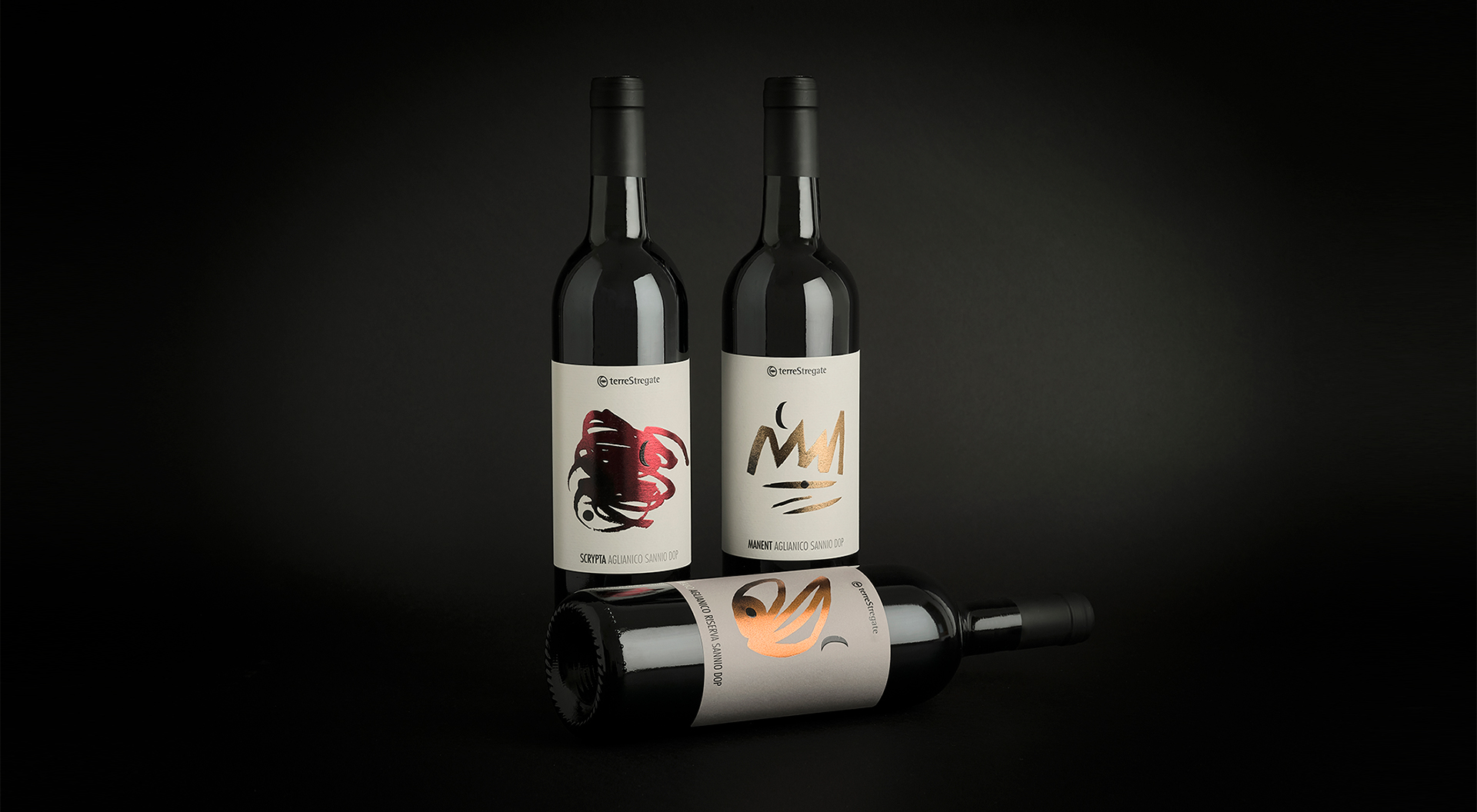
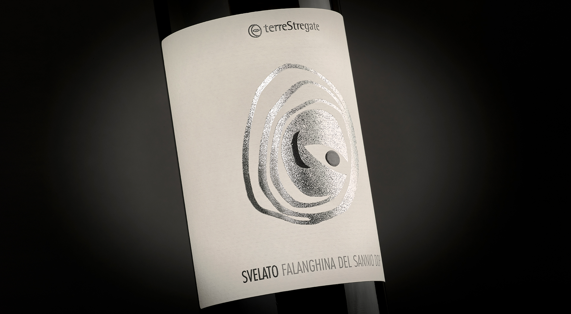
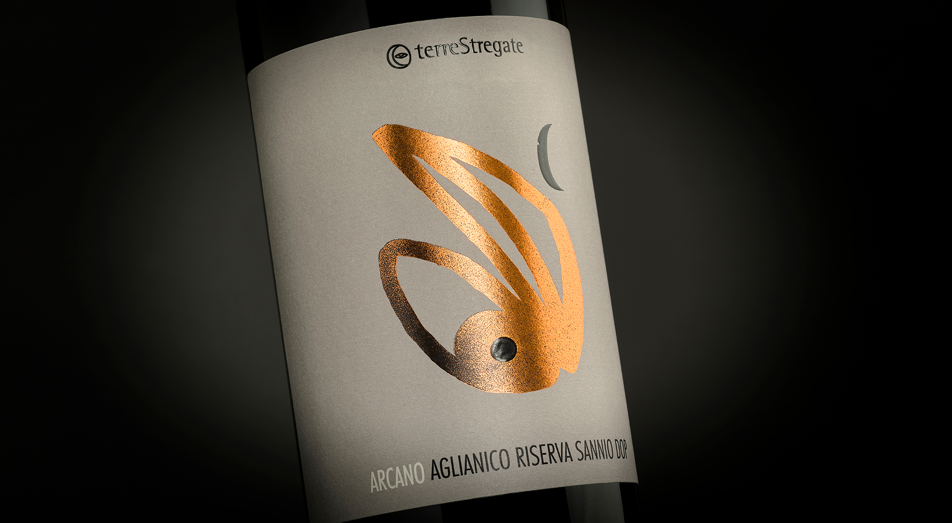
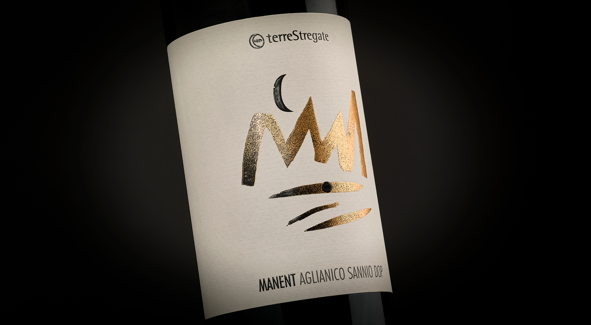
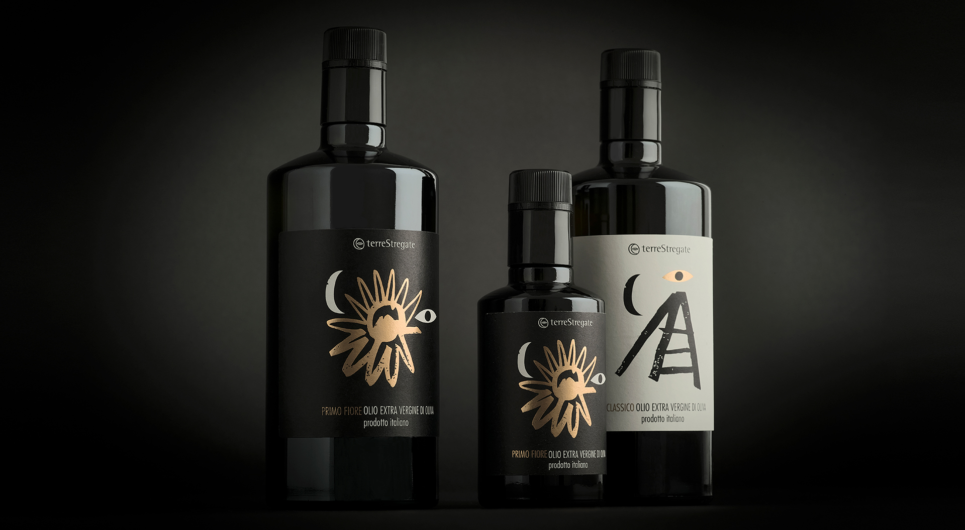
[:it]Esistono luoghi magici senza tempo dove maturano nettari preziosi. Come TerreStregate, a Guardia Sanframonti, in provincia di Benevento. TerreStregate è una storica azienda che produce vini e per loro abbiamo creato un nuovo packaging dedicato a tutti i loro prodotti. Il progetto si è basato sullo studio e poi sulla realizzazione di segni che sembravano nascere dalle radici della loro terra, disegnati come delle incisioni rupestri. I segni giocano con la luna e l'occhio, elementi che fanno parte dell'identità dell'azienda.
Segni attraverso cui raccontare la storia di una terra e di una tradizione. Ogni illustrazione è stata stampata con una lamina di colore diverso per ogni etichetta, aggiungendo una sovrastampa.
E la storia delle streghe.[:en]TerreStregate is a historic company that produces wines from Guardia Sanframonti, Benevento, in the south of Italy.
They asked us to work on a new project of packaging for their wines.
We decided to work on several signs that seemed to born from the roots of their land.
We also wanted to design something that would have continued to tell the story of the witches (from which the name of the company comes from. Terre Stregate means "Hauted Lands").
So we created this arcaic signs, rough and simple at the same time.
We used each sign for one wine, mixed with the moon and the eye, which are the elements that compose the logo of Terre Stregate.
Each sign has been printed in hot foil, every label has a different color of foil. [:]
client:
Terre Stregate
type of work:
Packaging
sector:
Wine & condiments
when?
2020
sound
share:
similar projects: