project:
Pietra dei venti - packaging design
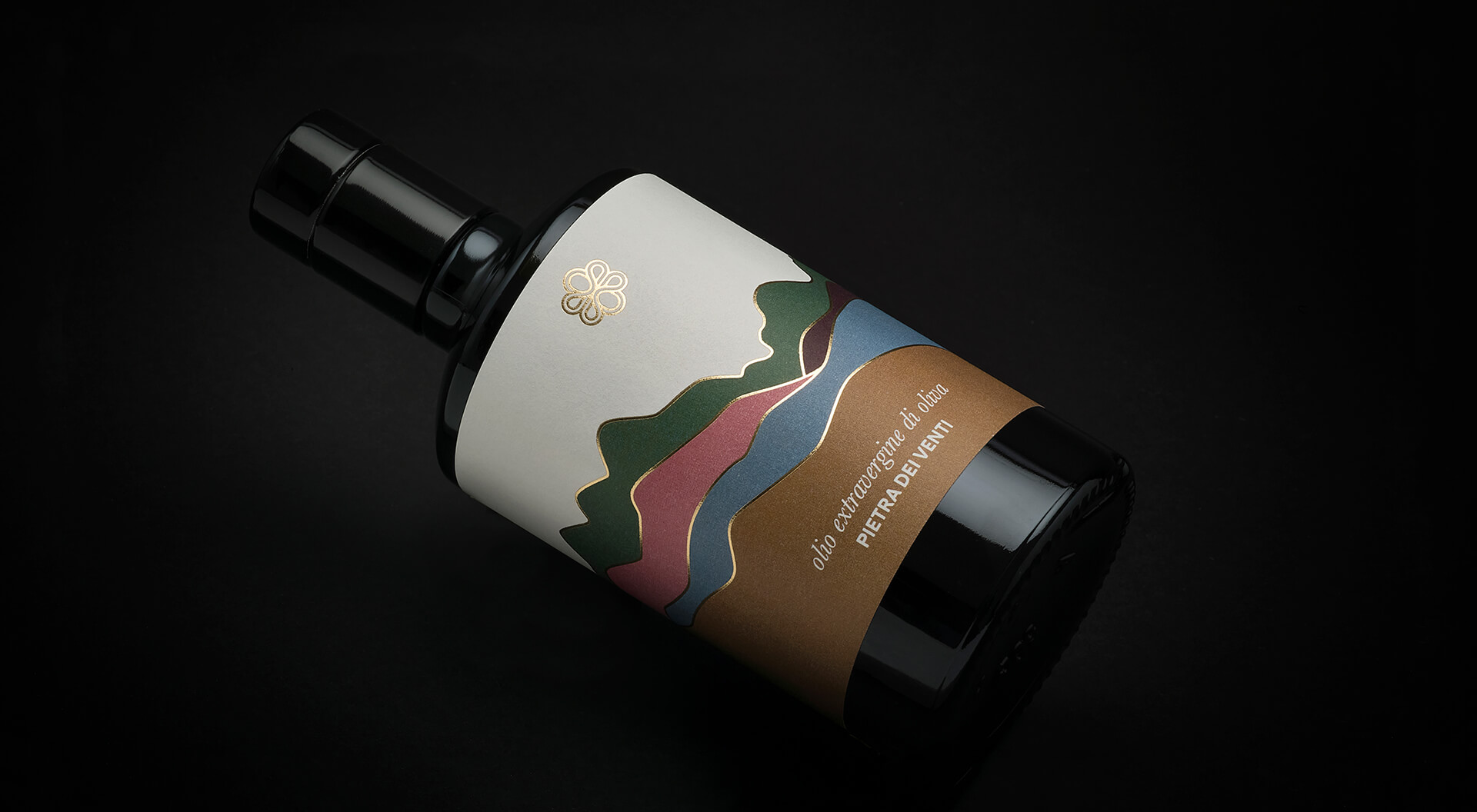
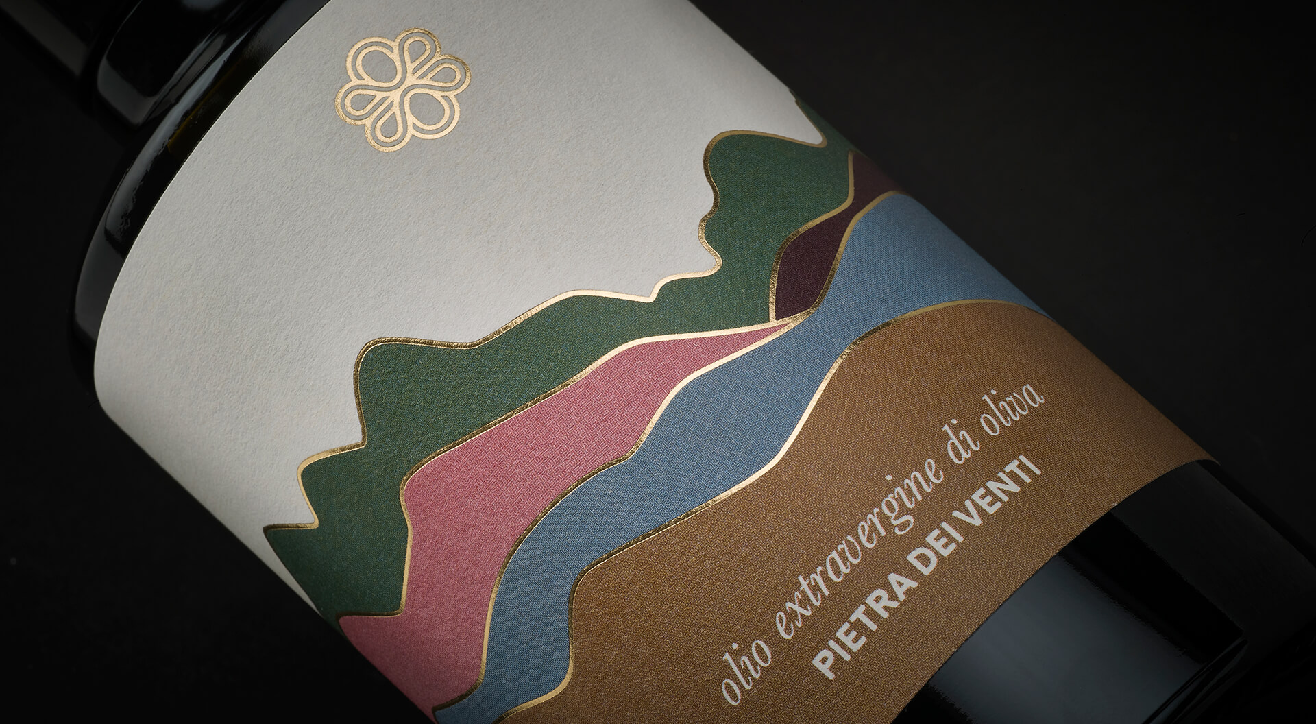
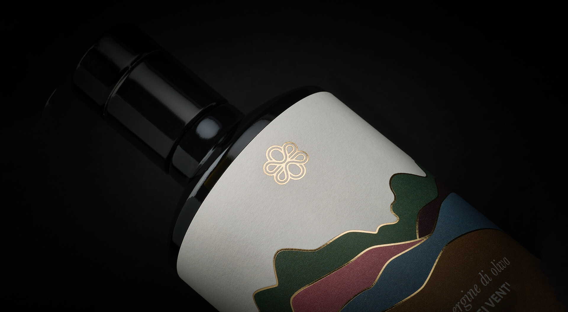
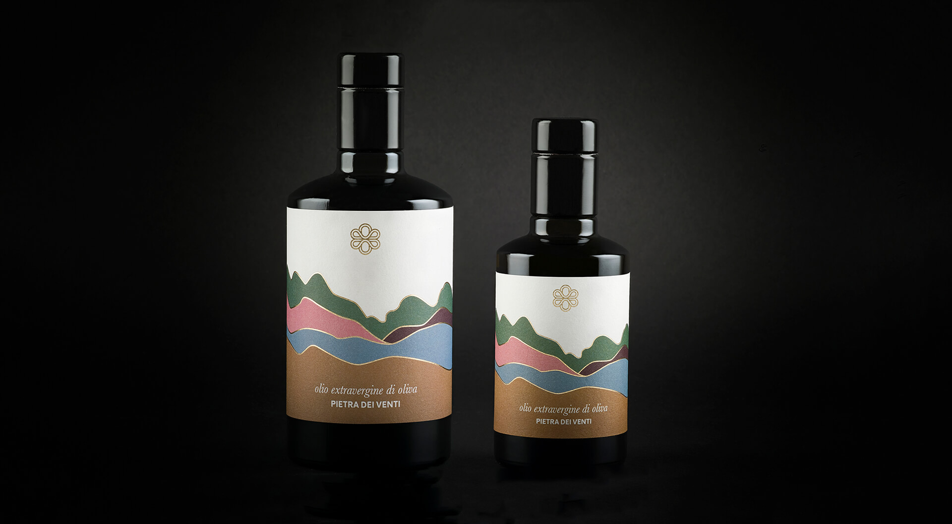
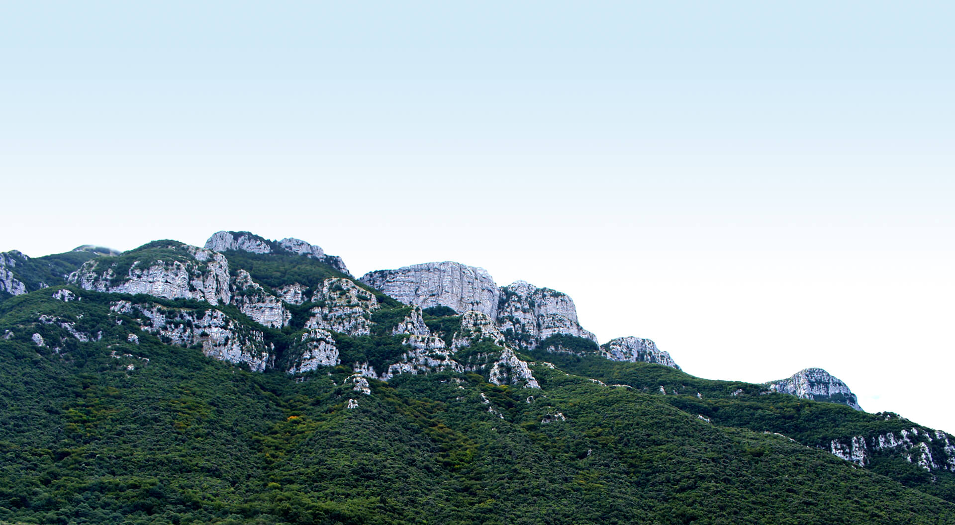
[:it]Prima di realizzare l'etichetta per l'Extravergine di Oliva di Pietra dei Venti siamo stati a trovarli in azienda e, mentre facevamo due passi tra i loro ulivi, abbiamo alzato lo sguardo e capito che per questa volta la natura aveva già pensato a tutto. A quel punto la strada per il progetto di packaging era segnata. Così abbiamo deciso di disegnare quello che si vedeva da lì: i Monti Alburni.
E di colorarli come la luce li colora nelle varie ore del giorno e della notte, abbiamo scelto delle tinte fredde e calde, che ricordassero l'alba il tramonto e l'imbrunire e ne abbiamo segnato i contorni con lamina oro a caldo, scegliendo una carta con una buona tonalità di bianco, una Tintoretto gesso grace proof con trattamento anti-macchia.[:en]Before starting the packaging design of Pietra dei Venti we have been in the olive fields of the company and we noticed that this time nature had already made the work.
So we decided to draw the view of the Monti Alburni that you can see from that fields and to add the colours that the Alburni have in the different hours of the day and the night, the sunrise, the sunset and the nightfall.
We printed it adding a warm white for the paper (Tintoretto gesso grace proof) and some hot gold foil lines.[:]
client:
Pietra dei venti
type of work:
packaging
sector:
food
when?
2019
sound
share:
similar projects: