project:
La fine prima dell’inizio
[:it]Maida per noi è quasi famiglia: un cliente che abbiamo visto crescere e che curiamo da tempo. La chiave dell’azienda è l’amore per i prodotti della terra che vengono lavorati a mano e conservati in vasetti dall’aspetto inconfondibile. Negli anni abbiamo tradotto questa passione in un’esperienza innovativa, essenziale, evocativa. Anche per la (sua?) nuova brochure le cose sono andate così: tagliando lo spazio e capovolgendo il tempo ci siamo immersi in un’avventura visiva, tattile e immaginifica. Ma iniziamo dalla fine…
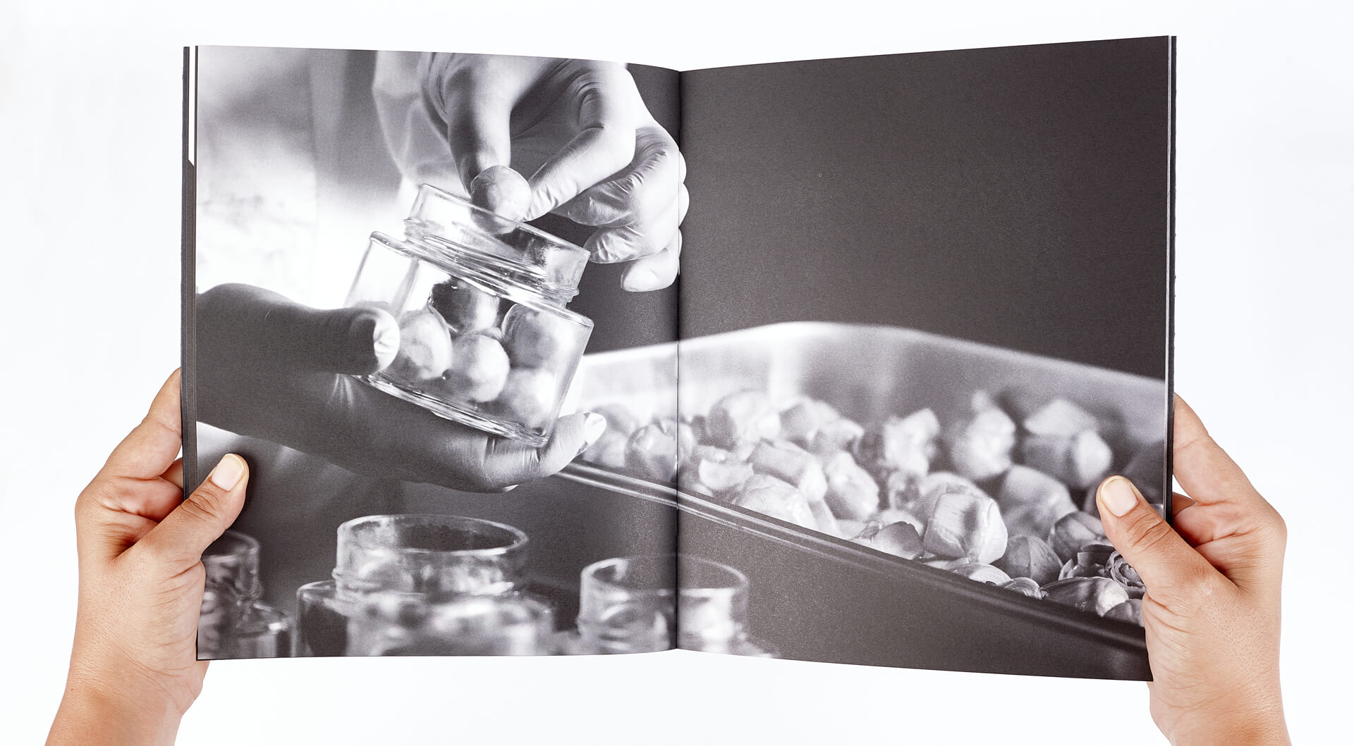
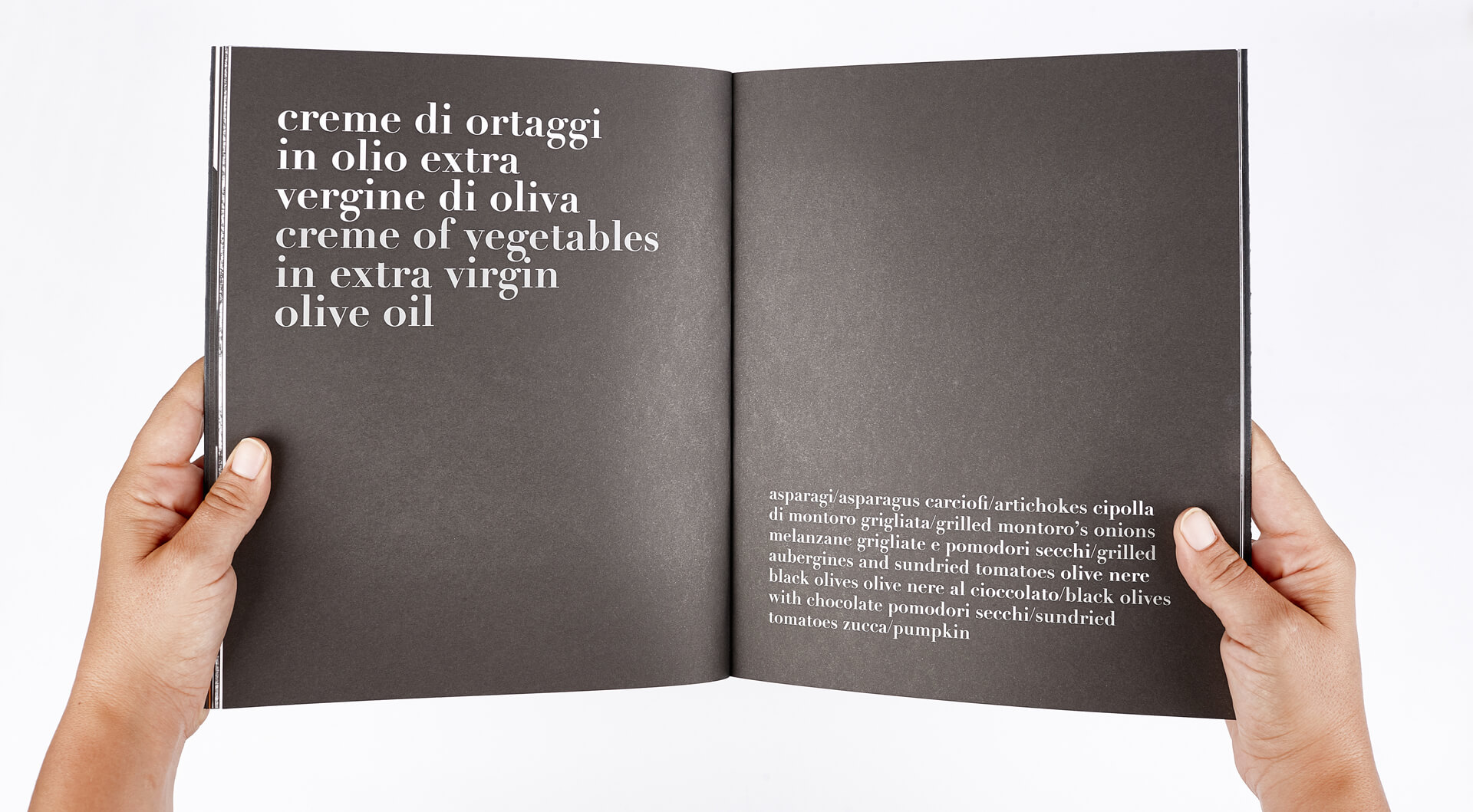
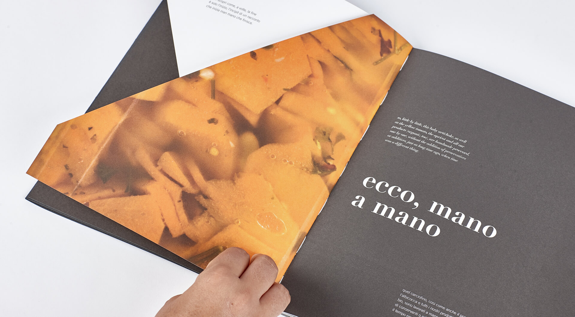
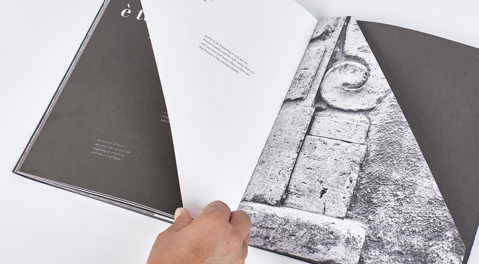
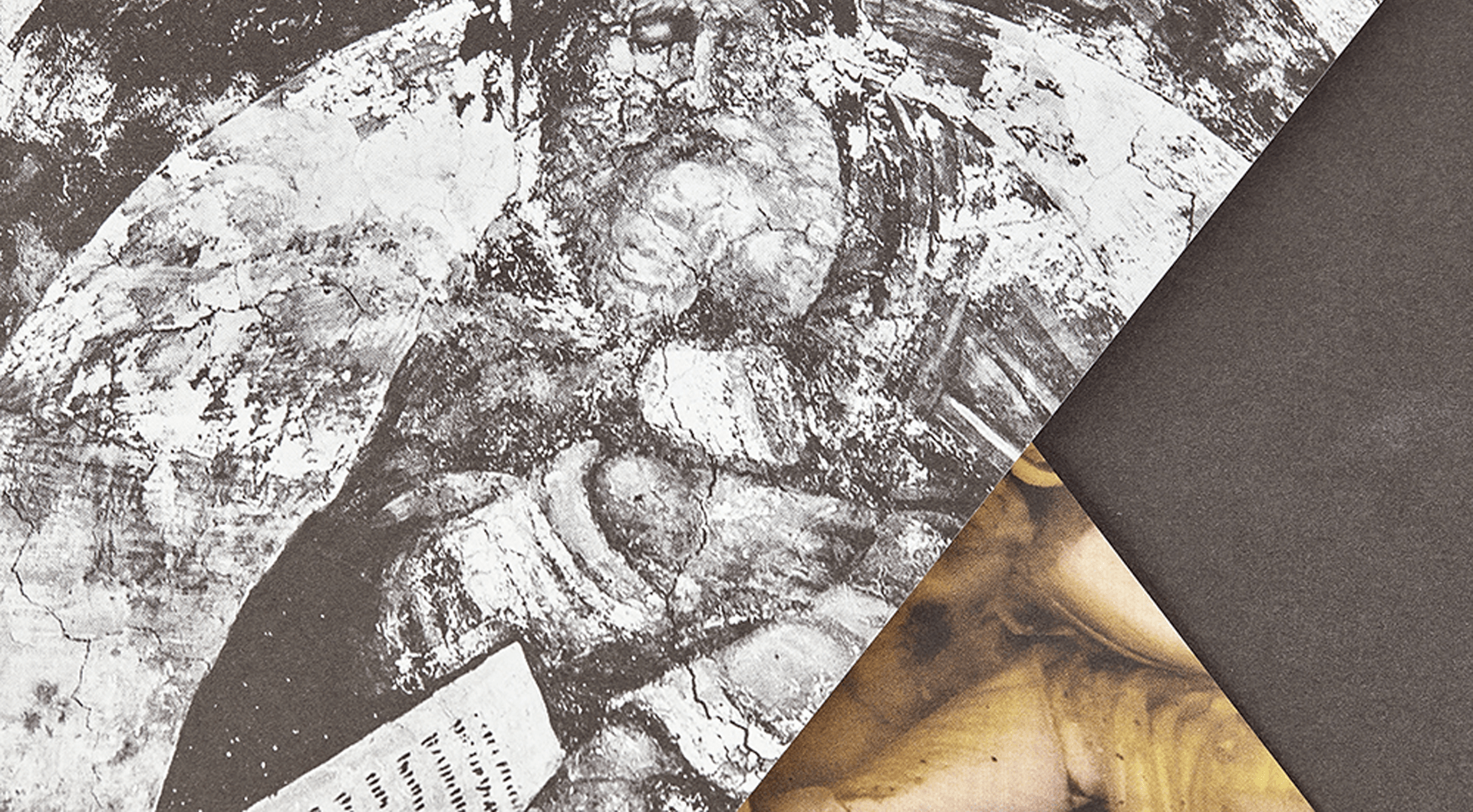
La brochure inizia proprio con la parola “fine” e inizia un percorso all'inverso. La prima immagine a comparire, stampata su una pagina che lascia intravedere la successiva, è il logo sul tappo: si procede poi a ritroso fino al prodotto fresco e alla sua coltivazione. Il nero e il bianco dominano per dare risalto ai colori degli ortaggi, dei legumi e dei sughi. La narrazione continua svelando poco a poco i luoghi, Paestum, la terra dove tutto è cominciato: perché il segreto è tutto lì, nell’inizio di ogni cosa. E infine la copertina: logo liscio e argento su sfondo nero e ruvido. Da guardare con le mani, da sentire con gli occhi. E poi c’era una volta...[:en]Maida is almost a family to us: a client who we have seen grow and who we have been taking care of for some time. The company's key feature is its love for products from the earth, which are processed by hand and stored in unmistakable jars. Over the years, we have translated this passion into an innovative, essential, evocative experience. And for the new brochure things went like this: chopping up space and turning time upside-down, we immersed ourselves in a visual, tactile and imaginative adventure. But let's begin at the end...
The brochure starts off with the words "the end" and begins a journey in reverse. The first image to appear is the logo on the top, printed on a page that lets you glimpse successive stages back to the fresh product and its cultivation. Black and white dominate in order to bring out the colours of vegetables, legumes and sauces. The text continues by revealing little by little the places, Paestum, the land where it all began: because the secret is there, in the beginning of everything. And finally the cover: a smooth, silver logo on a rough, black background. To see with the hands, to feel with the eyes. And there was once upon a time...[:]


share:
similar projects: